Project overview
@Home
Facilitating Your Recent Move
It can be challenging to navigate a new environment, whether it is a neighborhood down the street or across the country. For those who are relocating, it is important to find the necessary support to facilitate the relocation process: housing, restaurants, transportation, community events, etc. However, these can be difficult to find in one space. Resources like Google, Yelp, and Airbnb exist, but there is not a single space where various information and resources can be accessed for those experiencing relocation. To better support relocators, we designed and prototyped @Home, an app that can help users adjust to their new home quicker than ever before.
To develop this prototype, we followed a systematic process for designing interactive products. After establishing a high-level problem around relocation, we identified existing tools and applications that are competitors within the same problem space. We then identified potential users by developing user personas, creating scenarios, and conducting interviews with individuals who previously experienced relocation. We used this information to sketch and create storyboards and construct a user flow to envision how and why users may interact with this product. To design and evaluate the interface, we drew and tested paper prototypes, made wireframes, and iterated on our digital prototype.
Duration: August-December 2020
Team: AJ Carter, Shanley Corvite, Tianxiao Liu, Savannah Redlinger (SI 482 course)
Tools: Figma
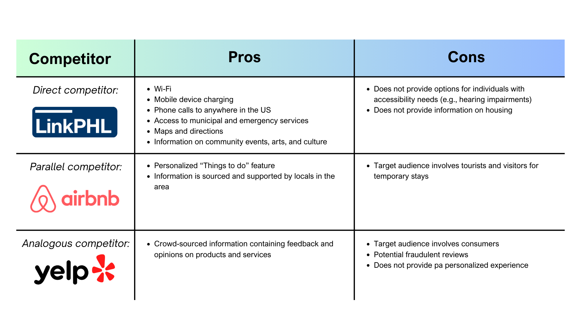
Part 1. Competitive analysis
Our original idea for an interactive product that can address relocation needs was a kiosk that can be found on city and neighborhood streets. This would make it accessible to individuals who are exploring and wandering in their new home. Thus, we looked for competitors offering similar interactive features that address information seeking needs of individuals who may be relocating.
Part 2. User interviews
To better understand the needs and desires of individuals who are locating to a new home, we conducted semi-structured interviews with people in our personal networks. As a team, we developed an interview protocol that asked people about their relocation process, challenges they faced, and information seeking behaviors.
I conducted two interviews and identified three themes surrounding relocation needs: building networks before relocation, access to communication channels, and checklists to organize important action items, which are described in further detail in the accordion.
Overall, these themes highlight key features users may look for in a tool that supports relocation. A potential feature to consider would be a channel for communicating with individuals and community groups prior to the relocation process. This is important for relocators as they adjust to living in a new environment, who can lean on existing and new connections.
-
Participants described the importance of having pre-existing connections with individuals in their new location before even relocating. This made the relocation process easier as these pre-existing ties allowed participants to grow their network. One participant who moved from the Philippines to Chicago, Illinois mentioned having friends and family already in Chicago and thus, it was “not really [hard to find a community] because again, the number one resource is friends and family, so if you have friends and family, they can easily introduce you to the same community.” Similarly, another participant who relocated from South Carolina to Ann Arbor, Michigan already have connections in Ann Arbor. This participant said: “I would say probably the biggest resource that benefitted, or that at least helped me with building my community was just knowing my roommate beforehand.”
-
Having pre-existing ties prior to moving are not always easy or accessibly for every individual who is relocating. Thus, it is important to provide such individuals with a space to create ties and build their network. one participant described that an information “communication channel” like GroupMe would be helpful for people to connect with others before moving. This could make the moving process much less stressful as it gives relocators a chance to develop potential friendships but also to ask for informational and tangible support.
-
When one participant described moving across the world, she described how difficult it was to know where to obtain important documentations, such as a state ID. She noted how it was challenging to find the critical locations, “especially key areas like the Secretary of State if you need to get a new license, or if you need to register your vehicle.” Another participant described how a tool containing a list of “things to do in the area” would be useful to integrate into the community, such as places that locals go to for sight-seeing and popular community groups to join.
Part 3. Personas and scenarios
Personas and scenarios are a critical component of user experience design and research in order to 1) understand the target audience and 2) design for their specific needs and desires. I developed a persona and scenario for an individual with a family and a small business.

Dan Maki
About
- Lived in Riverside, California with his wife and two kids
- Passion for cooking and feeding others, which led him to open his own business, Dan’s Diner
Concerns
- Not getting enough customers
- Far from populated cities
- Unsure of how to promote his business online
Goals
- Promote his business and gain more customers, particularly through online channels
- Make enough money to support his family
Behavior
- Loves to travel, do activities, and spend time with his family
- Uses Facebook regularly to connect with family
- Enjoys cooking and serving customers
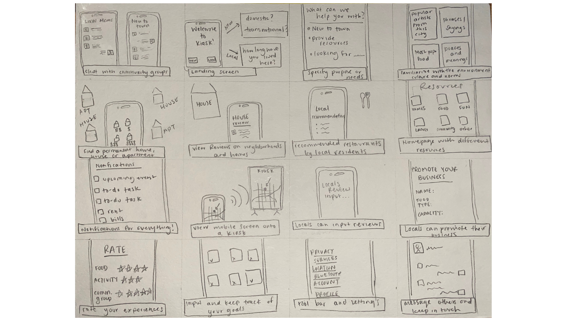
Part 4. Sketches and scenarios
At this point in our project, we recognized that an app for a mobile device would be more beneficial to design as people could easily access the platform wherever they were, even before relocating to their new home. While our initial design idea changed, many of our findings remained relevant and important to consider. We began sketching numerous potential features that we could integrate into our tool as a brainstorming exercise. Then, we designed storyboards where personas are using some of the features from our sketches.
Some features I sketched:
chat with community group
a place to specify needs
bluetooth connection between phone and kiosk
translate surroundings
find jobs of interest nearby
moving assistant to keep track of moving process

Part 5. User flow
Visually mapping the various flows a user can take through the app is important for designing individual pages, features, and how they connect. We created an information architecture diagram to display the different routes users can take in the tool.
🔑 Key
🔶 Yellow diamond - action item
🟣 Purple ovals - main pages
🔵 Blue ovals - sub pages

Part 6. Paper prototype and usability inspections
Based on our user flow, we each developed a paper prototype of our app. Click this link to view my paper prototype! This low-fidelity exercise focuses on functionality and ease of use. To test the prototype, we each conducted usability tests with individuals in our target audience – people who have experienced or anticipate relocating. To track our tests, we created usability defect logs which states the specific tasks, locations of the defect, types of problems, and other details regarding challenges participants experienced.
Through these tests, we identified issues with our prototype, which helped us improve our design for future iterations. For instance, I found that users were not aware of the swipe feature on the main page, the Discovery page. Our initial design was largely inspired by TikTok and the ability to scroll horizontally and vertically to access and navigate diverse information. Yet, we found this challenging for users, which may have been due to a lack of signals for scrolling.
Usability defect logs:
Task: visit your kitchen inventory
Location of defect: Discovery page
Type of problem: hidden feature
Notes: user did not notice that they can swipe up on the Discovery map to view more features and pages
Severity: Major
Location of defect: Inbox page
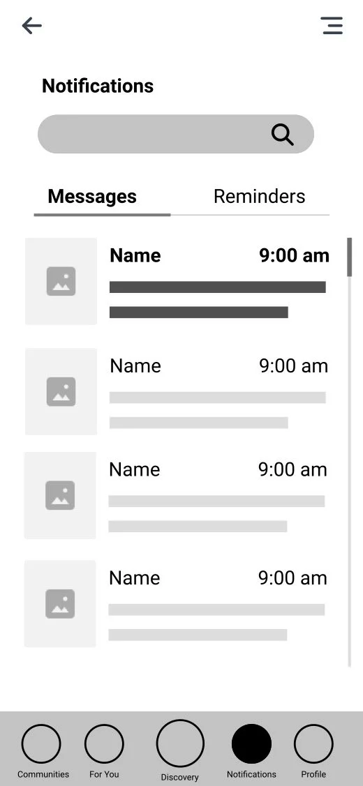
Type of problem: missing
Notes: bottom navigation is missing when the user enters the inbox page
Task: visit your October 19, 2020 log to view your tasks for the day
Location of defect: home page
Type of problem: confusing
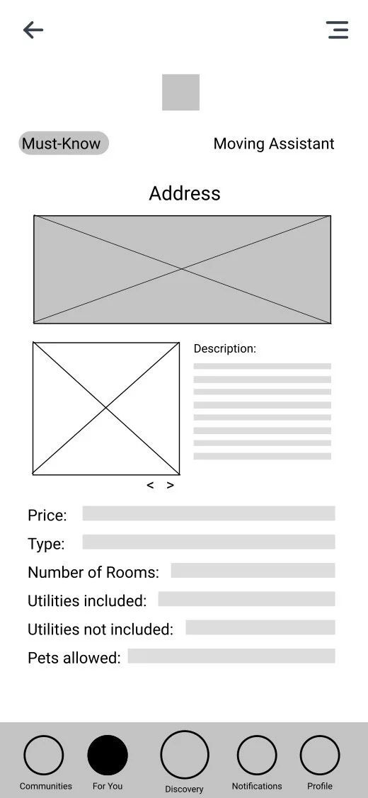
Notes: user was confused about the purpose of the Moving Assistant screen
Location of defect: profile
Type of problem: hidden feature
Notes: user did not notice the button to finish their edits
Location: Discovery page
Type of problem: hidden feature
Notes: user did not notice that they can swipe up on the Discovery map to view more features and pages
Part 7. Wireframing
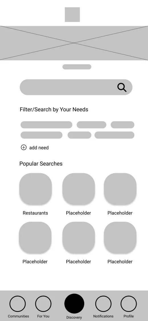
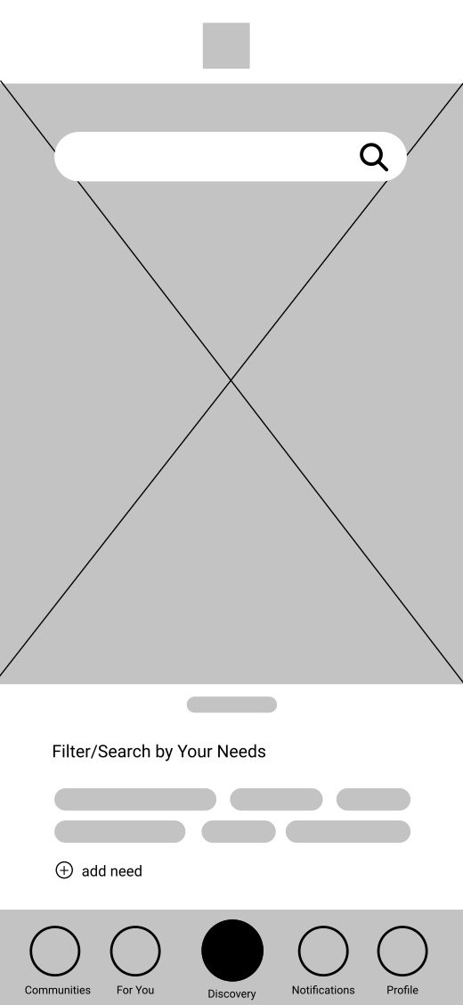

We created wireframes of our app to understand how the app might look in practice. One of the important design decisions we kept in mind as we developed our wireframes was the awareness of present position through visibility of the app’s navigational structure. For instance, if the user is on the Discovery page, the discovery icon in the navigation bar (at the bottom) should be designed in a way that indicates that the user is currently on that page. This makes navigation easy to use and understand, which is especially important for our app given the many pages and features users have access to. Scroll through the image carousel to view some of the wireframes!
Part 8. Digital prototype and testing
We began high-fidelity prototyping by discussing our branding. This included our color scheme, font type, and iconography, which are important for having a cohesive brand image. We decided on a light purple color scheme to provide a welcoming and warm environment for users. We used the Robot font as it is accessible. We also used buttons and icons with rounded corners for a more modern approach.
We developed our first draft of a digital prototype in Figma and conducted usability tests to capture any challenges users may face with navigating and using the app.
Summary of major issues:
User struggled to swipe up to see more on Discovery page
Users expected Discovery page to have more than just a map (e.g., content that you might see on TikTok’s FYP)
Users wished they could use filters on the map
Users struggled with an inconsistent navigation path
Users felt the FYP was confusing
Part 9. Final prototype and report
We made changes to our final prototype based on the usability tests described in part 6. We also regularly discussed and reminded ourselves of our goal – to support people during the relocation process. This is an important part of the UX research and design process, and a major takeaway of mine throughout the course. It is easy to want to design as many features as possible, but it can be overwhelming for both designers (to think about and develop these features) and users (to navigate through many features and find what they need).
Ultimately, we were able to design and prototype a platform that supported the relocation process (pre-move, moving, and arrival) through 5 key pages:
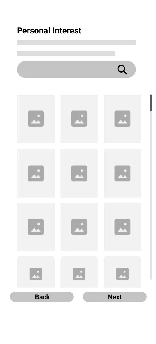
Onboarding: Signing up and getting accustomed to an interface is important for any app or technology. Thus, we made sure to design an onboarding flow that can help create a personalized experience for users.
Discovery: The Discovery page supports the key needs that we found from our user research, including finding key places or landmarks, housing options, and upcoming events nearby.
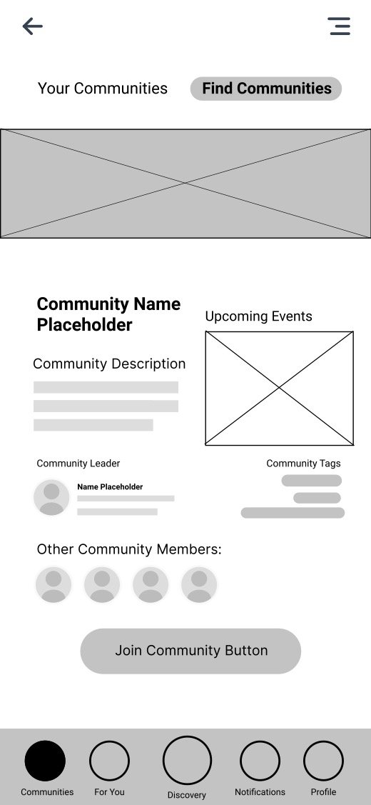
Community: Finding a community is beneficial for easing the relocation process, and thus, we created a page dedicated to joining and connecting with people in the new neighborhood.
Inbox: Relocation can be daunting, and we found that developing new and maintaining existing ties supported the relocation process. We prototyped an inbox page where users can reach out to people in the new neighborhood.
Profile: The relocation process can be long and contain numerous steps. Our profile page allows users to keep track of their location and tasks throughout the moving process.
